Listen to Earthbound on Spotify while reading!
Does everything have to be dark and gloomy when painting a death metal cover? EARTHBOUND says NO!
In this post, I’ll share how I tackled the challenge of creating vibrant and meaningful cover art for their album Chronos, as well as the additional design elements for their release.
Earthbound is a British melodic death metal band, and their style and themes revolve a lot around philosophy and spirituality. They approached me in early 2023 with some ideas for the cover art, and even provided some AI generated idea sketches, mainly for the colour theme. I happily accepted the project and started sketching.
It was quite a challenge to come up with the cover art considering they had the unusual request of a colour scheme consisting of pink and blue, but I’m always up for a challenge!
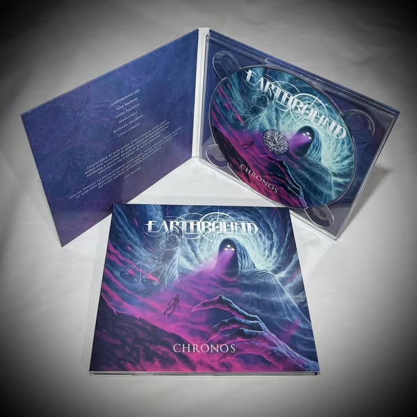
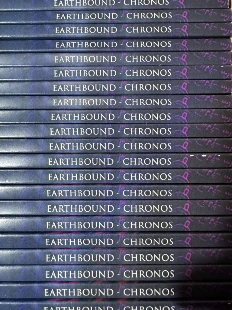
This project consisted first and foremost of the cover art itself, as well as the graphic design of three digital singles and layout of the physical CDs, plus an album t-shirt, but more on that later.
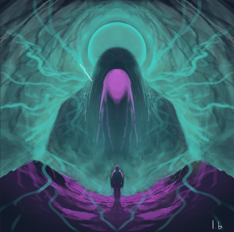
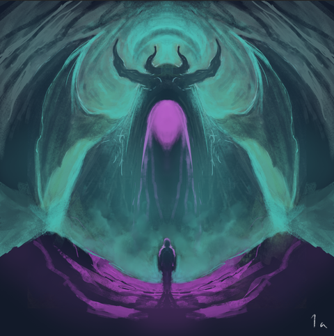
Early concept sketches for the album:
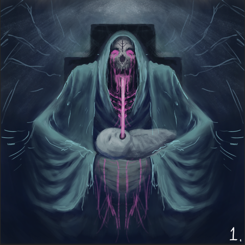
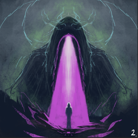
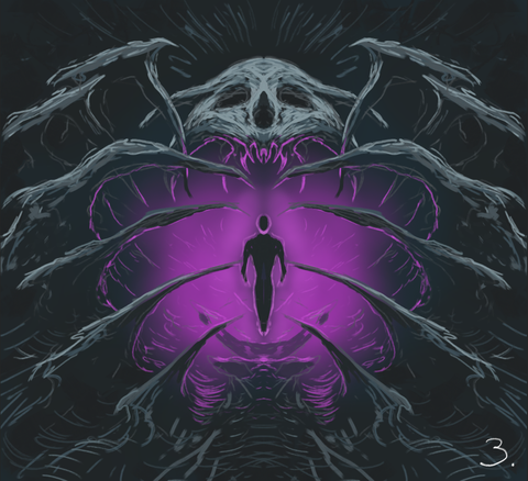
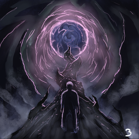
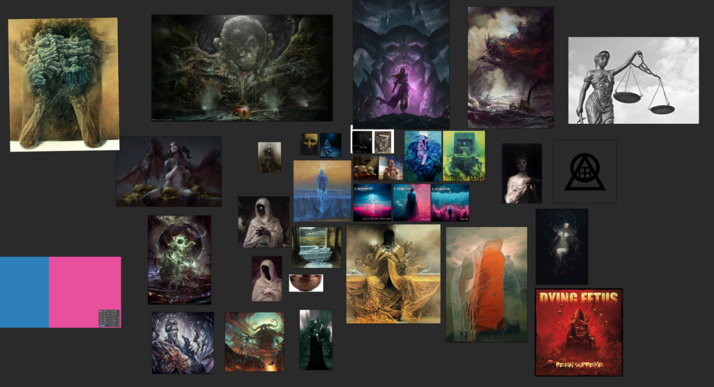
Here’s also a screenshot of the moodboard I created for working on this project. As you can see there are all manners of art and artstyles which I drew inspiration from for this project. In particular I referenced a lot of Bekzinski and Pär Olofsson.
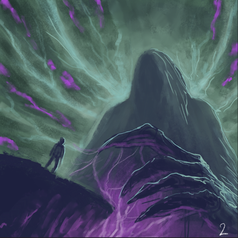
I developed the second sketch with minor variations, which the band responded to positively. However I didn’t like the composition as it was a bit too symmetrical and “head on”, which just felt a bit generic and boring. So I changed it, and took inspiration from an illustration by Pär Olofsson. He is one of my all time favourite metal cover artists so it was fun taking notes from one of his works.

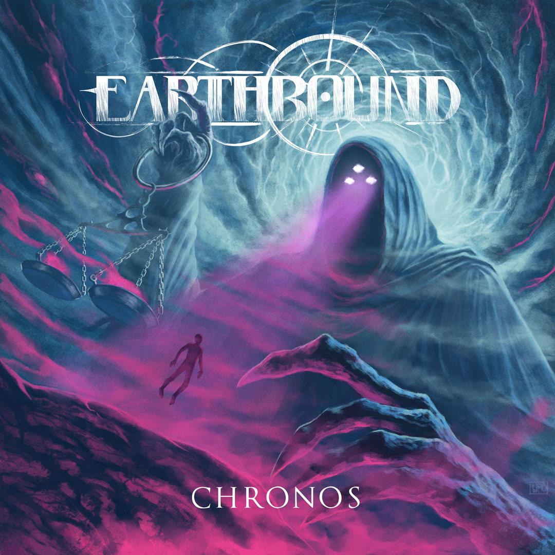
I wanted a more dynamic composition which I felt I achieved, and was able to include some storytelling and the elements requested by the band, such as the third eye and the scales.
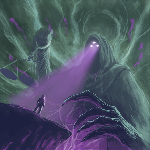
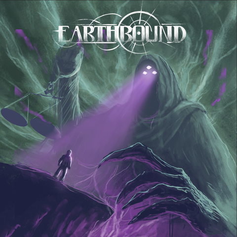
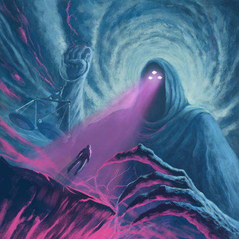
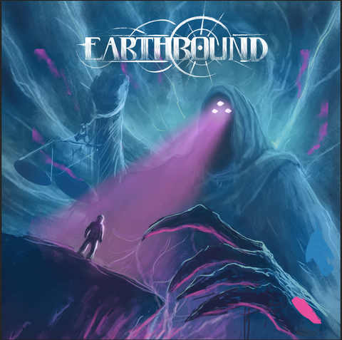
After finding the composition I pretty much just ran with it, leaning on the reference work I had next to me while rendering. Here’s the finishes artwork, and you can see the full timelapse below.

As soon as I got the final approval of the illustration I switched focus to work on the graphic design and layout of the digital singles and the jewel case layout.
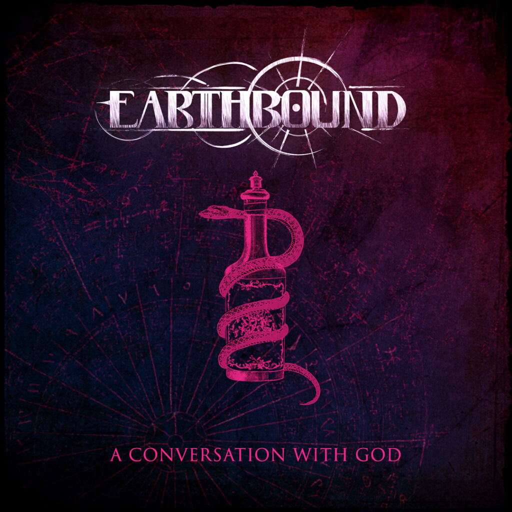
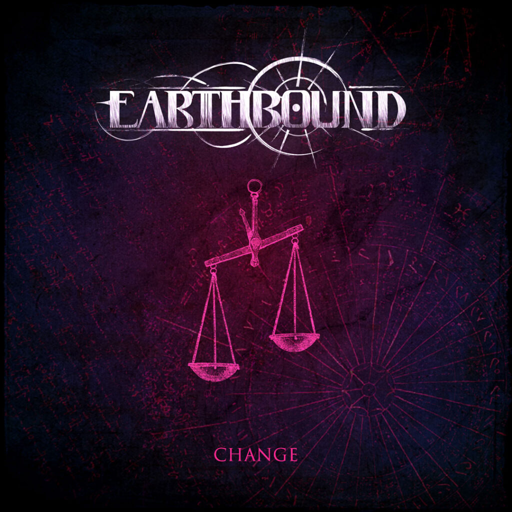
The singles were a fun addition to the main album artwork, and we went back and forth a bit, discussing what symbols were most representative for the songs. These were only used digitally. And the pink “spotlight” on the blue background travelled downwards through the three covers, symbolising some movement or change.

And then on to a quick t-shirt design, which was basically the album cover with a custom layout of the logo and title + a cool border. They even sent me a t-shirt and the print came out really nice. Old school screen printing for the win!
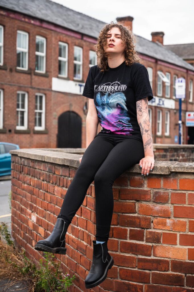
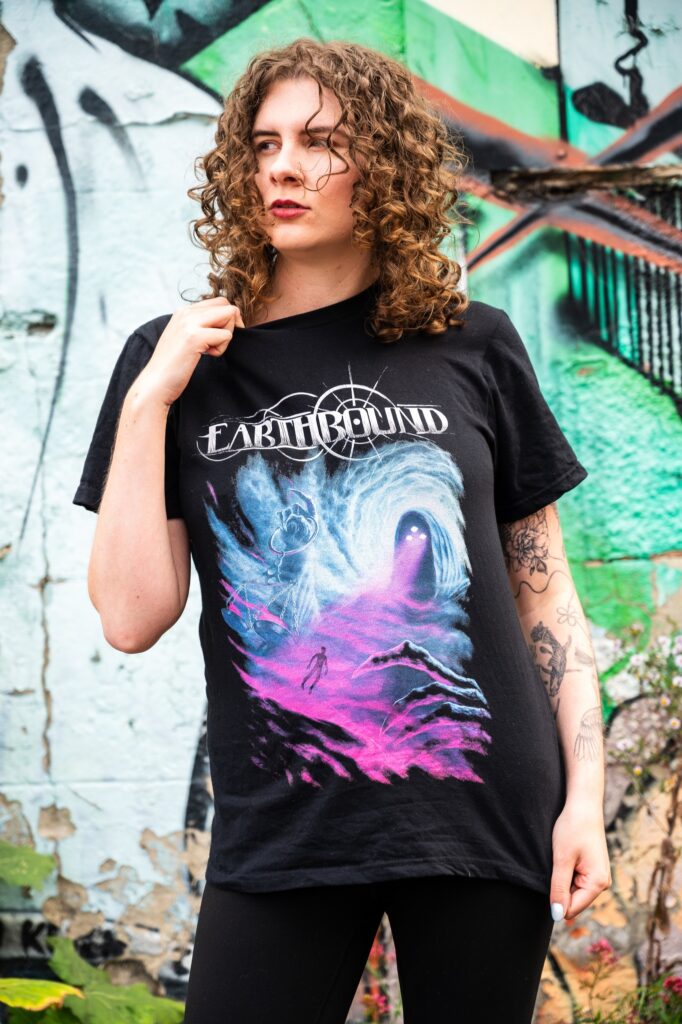
All in all it was quite a different kind of album cover for me, but I always love a challenge. And I really enjoyed having some abstract themes to work from, such as time, judgement et cetera. Also doing all the layouting for the phsyical printed media is enjoyable, as I can get a nice coherence between the art direction and the cover artwork.
I had a lot of fun working on all of the different aspects and parts of this project, and Earthbound are a bunch of great guys so it was quite easy and straight forward for me to have them as clients.
If you enjoyed this behind-the-scenes look at creating Chronos, let me know in the comments or share it with a friend who loves metal and art! And don’t forget to follow Earthbound for more incredible music.
Earthbound on Spotify
Earthbound on Facebook
Earthbound on Instagram
Leave a Reply